Sunday, 29 December 2013
Top 30 Camera Shots
I have just stumbled across this guide to Empire's top 30 camera angles, including multiple examples of films in which each one is used. This link I am finding extremely valuable.
The all-important link: http://www.empireonline.com/features/film-studies-101-camera-shots-styles/
Many of these shots are frequently used in the films that have influenced my plan for an opening sequence, such as the Deep Focus shot, POV shot and the Whip Pan.
Some of these shots I have previously been unaware of, and I feel using these new techniques will add depth to the work I produce on a visual level.
Tuesday, 3 December 2013
Audience Survey
Click here to take survey Here is the survey I have composed in order to collect audience information about film preferences. PLEASE TAKE THE SURVEY. Thank you.
*1. Which genre of film do you enjoy watching?
I put a link to my survey on my Facebook page and on an online forum. From the results of my survey, I found out that my audience would react very positively to a film of my chosen genre. The fan-base would be vast, with over 70% of results stating that the audience members would watch a pastiche film and also audition for one. Most of the results read that the audience play videogames for fun, so would be able to identify with some of the references I would make in my film.
*2. How many of these films have you seen?
*3. Would you audition to be in a film like this?
*4. Do you play videogames? If so, list here:
I put a link to my survey on my Facebook page and on an online forum. From the results of my survey, I found out that my audience would react very positively to a film of my chosen genre. The fan-base would be vast, with over 70% of results stating that the audience members would watch a pastiche film and also audition for one. Most of the results read that the audience play videogames for fun, so would be able to identify with some of the references I would make in my film.
Friday, 29 November 2013
Morecambe & Wise breakfast scene
For my 2 minute film piece, I am considering choreographing a scene similar to the one performed by comedy duo 'Morecambe and Wise'. I would intersperse this with shots of people running, as I think to pair the mundane task of cooking with frantic movement and panic of running would have comic value.
Friday, 22 November 2013
Film Opening Time Line
http://www.artofthetitle.com/title/great-expectations/#
Here is a film opening time line for 'Great Expectations' (2011)

00:02 - RAY WINSTON
00:06 - GILLIAN ANDERSON
00:11 - DAVID SUCHET
00:15 - and DOUGLAS BOOTH
00:21 - MARK ADDY, CHARLE CREED-MILES, SHAUN DOOLEY
00:23 - OSCAR KENNEDY, VANESSA KIRBY, IZZY MEIKLE-SMALL
00:27 - PAUL RHYS, JACK ROTH, CLAIRE RUSHBROOK
00:30 - screenplay by SARAH PHELPS
00:33 - produced by GEORGE ORMOND
00:35 - directed by BRIAN KIRK
00:42 - GREAT EXPECTATIONS
00:44 - by CHARLES DICKENS
The credits appear relatively oddly spaced, the number of seconds between them varying widely.
The music for this film opening seemed to build, starting softly at the beginning with only one or two instruments being played. As the piece moved on, more and more depth seemed to be added to it, and by the end of the opening the music had reached a delicate, reserved crescendo using only one instrument. This was effective when paired with the butterfly starting off translucent, then becoming more white/grey, then developing fine black patterns on it's wings until finally, it's jet black and in the iconic pose of a butterfly preserved for display - referencing part of the story, and one of Miss Havisham's famous lines.
Miss Havisham: [to Pip of a butterfly collection] "Look closer if you wish. My brother's collection. He went to the furthest reaches of the earth in his quest for the purest specimen of beauty. And when he found it, he stuck a pin through its heart. He's dead now. Cholera. In the tropics. Struck down in his relentless pursuit of beauty. Perhaps it was beauty's revenge to stop his heart when he had stopped so many others."
Iconic Sounds
Some of the key iconic sounds from the Pastiche genre are (I am looking at a mixture of comedy, action fantasy, gaming genres):
There are usually a lot of explosions in action films, so I might use this convention in my pastiche.
The game over track is an iconic sound, referenced in films with the video game theme to signal a death or the end.
The 8bit track is iconic to vintage video games which is often very relatable to gaming audiences.
The gun shot sound is extremely recognisable as it is used in a wide range of genres. People recognise it even if they've never even seen a gun in reality.
Zombies are one of the most popular human-mutant features in fantasy films, and their moan is easily replicated seeing as they are formed from creatures that were once human beings.
Thursday, 21 November 2013
Typical Synopsis
Typical Synopsis for an 'Action-Comedy' -
A down-trodden 'lovable loser' type character is living their unsatisfying life undisturbed. Then something significant happens requiring them to become a hero or use some physical/metal skill only they possess to overcome the villain. They will often be taken out of their natural everyday environment and end up somewhere they don't know how to behave. They may come across another, 'hero type' character who becomes their guide/love interest/friend. In the end the loser gains respect after defeating his enemies and returning home where their life is considerably better, usually after honing their special skill. These will contain a lot of slapstick in comparison to an Action film.
Typical Synopsis for a 'Syfy-Comedy' -
A 'nobody' character may be living perfectly happily until a series of unusual events begin to occur. They may be told by another (more experienced) character that they possess supernatural capabilities. They must then work on their powers to become strong enough to: save their home planet/dimention, overthrow an evil ruler in a futuristic world/setting, or save the planet from certain destruction by another planet. There is often an impossible feat the character must perform, and using their special powers (which should be more powerful than anybody else possessing them) save everyone. In the end they settle in to using their powers, and are often made a leader or a ruler due to their bravery. These are often feel good films, opposed to Syfy.
Typical Synopsis for a 'Teen-Comedy' -
A nerdy teenager whom is particularly unpopular usually attempts to boost their social status by providing fake IDs/alcohol/drugs, resulting in much physical comedy. They will often have feelings for a popular girl considered way out of their league, but will attempt to court them anyway. The police are often involved and make attempts to try and stop them. Eventually, the nerd uses their natural intellect to get the popular people out of a bad situation, sometimes by sacrifising themselves. These films can end in two ways. The first, the nerd gains the respect of their peers, gets the girl, and is happy. The second (and more popular version) the nerd is popular for that night and that night only, and the next day at school they are treated just as they were before and the girl refuses to date them. The character may be happy that he achieved the goal, just for the night, or angry that it didn't last for more than a few hours.
My hopes for my film opening is to use aspects of all three of these film genres and create a divine hybrid of lonely characters, social status, peer pressure and unconventional heroes.
Typical Synopsis for a 'Pastiche Film' -
A group of mundane, introverted nerds from different walks of life, ages and families come together for a greater good, either for the sake of everyone or against their will. Each character has an attribute exclusive to them which the group cannot function without. One link from the group will falter and leave and it is up to the rest of the group to restore order and regain their trust to defeat the demons and their demons. Everybody wins, a lot of death is usually expected.
Audience Expectations
Here I have interviewed some potential audience members to find out what they expect from my chosen genre of Pastiche film.
Other answers:
Jenny - "There will usually be a loser character, but in the end they'll turn out to be the hero".
Shona - "The little guy will beat the big guy using his intellectual power".
As a fan of my chosen genre, my personal expectations are for a misfit protagonist character to find a purpose, willingly or unwillingly depending on the antagonist and 'side-kick' characters. An 'otherworldly' force or power enters the world and to complete the journey of personal growth and self respect of everyone present it must be understood and teamwork must be applied after an initial period of nerdy hostility.
Tuesday, 19 November 2013
Juno 9 Shot #2


Shot 1 -
The film kicks off with a shot of Juno, walking down the street carrying a family sized carton of orange juice. She is dressed very casually as if she isn't particularly bothered about her appearance or what other people might think. This is reinforced when she meets a group of track runners in matching uniforms. The uniforms completely contrast Juno's clothes, as the shorts the runners wear show a lot of skin, and people would expect those to be worn in summer weather, even though it appears to be autumn. She is walking one way down the pavement and the boys run the other way, parting around her like a school of fish. This shows that she goes against the crowd, unconventional and unaccepted in this way. Once the runners leave he screen, the style changes to roughly sketched outlines. The buildings appear only as concept drawings and childish shading provides the colour. This is relevant due to the film being about children and pregnancy.

Shot 2 -
Shot 2 is shorter, and shows a lot of different textures. The houses are now made of grid paper and nothing casts a shadow but Juno. The credits look as if someone has drawn them in bubble writing to make them stand out. The windows are blank and show nothing within. Also, only the primary colours are featured here. Everything is very basic - apart from Juno. Her sketched self is very detailed a realistic, with the artist having drawn the folds in the fabric of her clothes and accurately cast her shadow. There is nobody else in the shot, which echoes the notion of Juno being/feeling alone.

Shot 3 features leaves that look as if they have been cut out of a magazine, only their outlines have not been properly trimmed off - also quite childish. Her shadow is not as accurate, and appears as if the light source is directly above her. The grass is very juvenile, having no texture and consisting only of seams. Juno is again the most detailed image in the shot.

Shot 4 is another pan, and now all seams are gone also. There is no telling where the ground is, where it begins or where it ends. The leaves are much less detailed as well, as if everything in Juno's world is getting simpler and simpler, more childish and messier. The minivan appears to be suspended in mid air seeing as their are no guidelines or shadow.

Shot 5 -
Here shot four runs into shot five. Shot four Juno can be seen walking across the top of shot 5 for the duration, whilst shot five Juno walks towards the camera, yet never moves. The houses, ground and bins are all one block colour, as if drawn as part of a cartoon that remains uncoloured.

Shot 6 -
The telephone pole is relatively 2D, which is a traditional convention in children's cartoon programmes. The lamppost blends into the sky and the cables are pencil thin, making it somehow lazier than real life.

Shot seven looks quite like a collage in that the trees and Juno are photographed but the houses, birds, sky and clouds are all sketches. The mixture of outlines and detail layered together along with the awkward 'stop motion' walking make the shot seem very divided.

The ground in shot 8 seems very unnatural, and there is no sign of nature here as there has been in the previous shots (trees, leaves, clouds etc.). Here it doesn't look as if Juno is actually walking on the driveway almost, which goes back to the layering. She also walks past some important items that appear later in the film, which the audience don't realise yet. Also, the sketching on her clothing seems to be getting simpler, especially her shoes and her left hand. Again there is no shadow. The shot looks cold and hard, again only using primary colours which make the shot look drained.

Again, shot nine shows Juno walking down the street at a less than natural angle. the fence and the buildings seem almost out of proportion in comparison to her. The horizon has melded together and has been reduced to white, blue, and pencil thin outlines. It is as if the further Juno walks, the less detailed, colourful and realistic the world looks, as if it stops where the pavement stops. It is almost as if she's walking off the edge of the clip and if she hand walked the other way from where the film started she would look natural and so would everything else. It would all stay normal, which is like her life - she had two options 'pregnant' or 'not pregnant'. Because she became pregnant her world disintegrates around her. If she had continued on without this life changing event happening to her, she would go on as normal.
Again this film is one I'd like to take as much inspiration from as I can, as I feel the opening is so effective and the feeling the audience gets from the grunge-nerd style is what I'd like to apply to my film.
Sunday, 17 November 2013
Scott Pilgrim - 9 shots
http://www.artofthetitle.com/title/scott-pilgrim-vs-the-world/

Shot 1 -
The first shot of the film shows the iconic 'Universal globe', rotating as it does at the start of all Universal productions. When the icon appears (unconventionally slides) on the screen the audience expect the usual orchestrated theme that accompanies the globe, but instead they hear an 8-bit mock up rendition, more suited to a videogame than anything else. Also, the letters seem slightly pixelated and the globe moves another cell in rotation every 1/4 second. This is just as iconic as the Universal logo as 'vintage videogames' are very popular. This sets the tone/theme for the film as these references crop up throughout, and compels the audience to keep watching as this is a clear hint that the film is going to try to entertain you.
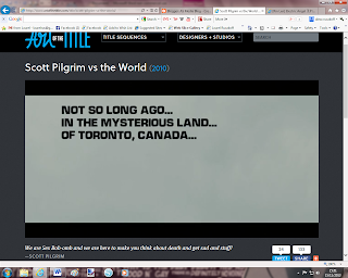


Shot 2 -
Once the audio has ceased, the second shot begins with a voiceover reading the text that appears on the grey screen. The lines of text appear one at a time, giving the audience a chance to read it for themselves before the voice does. The style in which the voice speaks is extremely similar to the narrators in the genre of fantasy films, where a voiceover introduces where the action is going to take place, when it is set, and often who the protagonist is.
This is beginning to set the scene for the audience, not only using the information the voice provides, but also allowing people to realise which stereotype the film is playing up to. The typical nerdy male gamer that is such an entertaining cliché to play up is taking centre stage here with the fantasy film and 8-bit gamer references. By using these, before you meet him the audience already know a significant amount of Scott's character. Also, these have a lot of comedy value. It is a fairly long shot, and as the first lines of text fade away, two more appear - again in fade - that set up exactly what is happening, allowing the audience to jump right into the action.
As the shot pans down a little more, the audience realises the grey background in reality was the sky, setting the gloomy tone the film opening takes. When finally the shot is still again, we see the roof of a house. The audience may assume this is Scott's house, and this sets up even more humour that will be realised later in the film when the audience see Scott's living conditions. The snow makes everything seem grey and cold, and the quietness creates a sense of anticipation for the audience. To finish, we here a woman's voice (as well as a musical chime (as if a memory)) as if replying to the narrator, repeating what he said as if displeased. This is a straight lead into the action.
 Shot 3 -
Shot 3 is extremely short in comparison to shot 2, and very impersonal. Even though we see four characters straight off, none of them reveal their faces to the camera as if purposely ignoring it.
The table has four chairs around it, and this fact leads the audience to think that the four people in the shot are the only people who sit in those chairs, and so are a secluded and solitary group. None of the items in the shot are very modern and this hints to the audience that as a group they are not particularly wealthy. Regardless of the snow outside, 2 out of the 4 are wearing short sleeved t-shirts. This could show the audience how regular this harsh weather is, or that they wear the same clothing all year round, due to the lack of funds.
 Shot 4 -
The following shots from now on are 'Shot Reverse Shot'. Shot four shows Kim from Scott's eye level, so the camera must have been tilted to make it seem as if the audience sees what he sees. It is also slightly darker in Kim's corner, and her dialogue is spoken with distain. This may reflect her dark personality and show the audience what kind of person she is.
 Shot 5 -
Again, like shot 4 we see a 'Shot Reverse Shot' of Scott and Kim. There seems to be no 180 degree rule here as someone looking on would have to move continually around the kitchen to get at the angles of each characters face. Scott's corner seems a bit brighter, also you see more of Kim's head than you did of Scott's shoulder, as if the audience was actually looking past the back of Kim's head (in the room). When Scott speaks he doesn't turn around. At this point the audience still hasn't seen the face of the title character, also establishing the relationship between the too characters as quite casual.

Shot 6 -
A mid-shot of Kim, just about fitting her head in the frame. When she speaks she stays very still and doesn't use much energy in her speech or facial expression. This helps to set the lethargic mood in the scene.
 Shot 7 -
Scott is introduced. This is also another mid shot, as if every shot style is then mimicked one more time by the other character. Another game reference is the ID box. These are used to introduce the name, rating/ranking, special skill and sometimes personal information in a videogame when selecting the character you want to play with. Placing it here is useful and comic, especially as each character (as well as this one) has an official rating from some unknown source. This is placed to take the audience back to when they might have played a game like this and looked for the player with the best rating.
 Shot 8 -
Shot 8 introduces a new character. Behind this character (Steven Stills) we see the only modern appliances in the room. There are items behind him that do not automatically spring to mind as being typically owned by people of this age group, e.g. substantial spice rack, wok etc... which may hint to the audience that this is/was a family house. This also begins a new 'Shot Reverse Shot' between Steven Stills and Scott. Again, the lack of energy and enthusiasm adds to the lethargic feel of the scene, even though Stills' dialogue states the opposite of Kim's.
 Shot 9 -
The final shot in this analysis shows the final character in the scene not yet mentioned - Young Neil. He has not yet taken an interest in the conversation, which may be the reason the space behind him is the most dark, as he is the least involved as he has been absorbed in his videogame. This is the most up-to-date piece of machinery and is symbolic seeing as it has kept the character out of the conversation so far, and yet there are so many references made. The design on his shirt is also similar to the device in his hand, as if by playing the game he is fulfilling the action suggested to him. The audience also sees what appear to be a very washing machine and dryer, which again are not typical appliances for people of this age to own. The fact that they are outdated hints that they may have been left there when the rest of the family moved out.
This film is what I feel I will take much of my inspiration from, as the themes such as 'videogame style' and overdramatized shots I find entertaining and fun to work with.

Shot 1 -
The first shot of the film shows the iconic 'Universal globe', rotating as it does at the start of all Universal productions. When the icon appears (unconventionally slides) on the screen the audience expect the usual orchestrated theme that accompanies the globe, but instead they hear an 8-bit mock up rendition, more suited to a videogame than anything else. Also, the letters seem slightly pixelated and the globe moves another cell in rotation every 1/4 second. This is just as iconic as the Universal logo as 'vintage videogames' are very popular. This sets the tone/theme for the film as these references crop up throughout, and compels the audience to keep watching as this is a clear hint that the film is going to try to entertain you.


Shot 2 -
Once the audio has ceased, the second shot begins with a voiceover reading the text that appears on the grey screen. The lines of text appear one at a time, giving the audience a chance to read it for themselves before the voice does. The style in which the voice speaks is extremely similar to the narrators in the genre of fantasy films, where a voiceover introduces where the action is going to take place, when it is set, and often who the protagonist is.
This is beginning to set the scene for the audience, not only using the information the voice provides, but also allowing people to realise which stereotype the film is playing up to. The typical nerdy male gamer that is such an entertaining cliché to play up is taking centre stage here with the fantasy film and 8-bit gamer references. By using these, before you meet him the audience already know a significant amount of Scott's character. Also, these have a lot of comedy value. It is a fairly long shot, and as the first lines of text fade away, two more appear - again in fade - that set up exactly what is happening, allowing the audience to jump right into the action.
As the shot pans down a little more, the audience realises the grey background in reality was the sky, setting the gloomy tone the film opening takes. When finally the shot is still again, we see the roof of a house. The audience may assume this is Scott's house, and this sets up even more humour that will be realised later in the film when the audience see Scott's living conditions. The snow makes everything seem grey and cold, and the quietness creates a sense of anticipation for the audience. To finish, we here a woman's voice (as well as a musical chime (as if a memory)) as if replying to the narrator, repeating what he said as if displeased. This is a straight lead into the action.

Shot 3 is extremely short in comparison to shot 2, and very impersonal. Even though we see four characters straight off, none of them reveal their faces to the camera as if purposely ignoring it.
The table has four chairs around it, and this fact leads the audience to think that the four people in the shot are the only people who sit in those chairs, and so are a secluded and solitary group. None of the items in the shot are very modern and this hints to the audience that as a group they are not particularly wealthy. Regardless of the snow outside, 2 out of the 4 are wearing short sleeved t-shirts. This could show the audience how regular this harsh weather is, or that they wear the same clothing all year round, due to the lack of funds.

The following shots from now on are 'Shot Reverse Shot'. Shot four shows Kim from Scott's eye level, so the camera must have been tilted to make it seem as if the audience sees what he sees. It is also slightly darker in Kim's corner, and her dialogue is spoken with distain. This may reflect her dark personality and show the audience what kind of person she is.

Again, like shot 4 we see a 'Shot Reverse Shot' of Scott and Kim. There seems to be no 180 degree rule here as someone looking on would have to move continually around the kitchen to get at the angles of each characters face. Scott's corner seems a bit brighter, also you see more of Kim's head than you did of Scott's shoulder, as if the audience was actually looking past the back of Kim's head (in the room). When Scott speaks he doesn't turn around. At this point the audience still hasn't seen the face of the title character, also establishing the relationship between the too characters as quite casual.

A mid-shot of Kim, just about fitting her head in the frame. When she speaks she stays very still and doesn't use much energy in her speech or facial expression. This helps to set the lethargic mood in the scene.

Scott is introduced. This is also another mid shot, as if every shot style is then mimicked one more time by the other character. Another game reference is the ID box. These are used to introduce the name, rating/ranking, special skill and sometimes personal information in a videogame when selecting the character you want to play with. Placing it here is useful and comic, especially as each character (as well as this one) has an official rating from some unknown source. This is placed to take the audience back to when they might have played a game like this and looked for the player with the best rating.

Shot 8 introduces a new character. Behind this character (Steven Stills) we see the only modern appliances in the room. There are items behind him that do not automatically spring to mind as being typically owned by people of this age group, e.g. substantial spice rack, wok etc... which may hint to the audience that this is/was a family house. This also begins a new 'Shot Reverse Shot' between Steven Stills and Scott. Again, the lack of energy and enthusiasm adds to the lethargic feel of the scene, even though Stills' dialogue states the opposite of Kim's.

The final shot in this analysis shows the final character in the scene not yet mentioned - Young Neil. He has not yet taken an interest in the conversation, which may be the reason the space behind him is the most dark, as he is the least involved as he has been absorbed in his videogame. This is the most up-to-date piece of machinery and is symbolic seeing as it has kept the character out of the conversation so far, and yet there are so many references made. The design on his shirt is also similar to the device in his hand, as if by playing the game he is fulfilling the action suggested to him. The audience also sees what appear to be a very washing machine and dryer, which again are not typical appliances for people of this age to own. The fact that they are outdated hints that they may have been left there when the rest of the family moved out.
This film is what I feel I will take much of my inspiration from, as the themes such as 'videogame style' and overdramatized shots I find entertaining and fun to work with.
Monday, 11 November 2013
Relevant 'Oldies' (3)
Here are (in chronological order), the 5 'classic' films most relevant to the mixed up franken-genre I would like to use to form a concrete foundation for my film opening:
Monty Python 1975
The Rocky Horror Picture Show 1975
Blackadder 1988
Van Helsing 2004
Skyfall 2012
These all contain references to films other than themselves and were made in the last 40 years.
Monty Python 1975
The Rocky Horror Picture Show 1975
Blackadder 1988
Van Helsing 2004
Skyfall 2012
These all contain references to films other than themselves and were made in the last 40 years.
Thursday, 7 November 2013
Director People (2)
Edgar Wright
Directed: Shaun of the Dead, Hot Fuzz, the World's End, Scott Pilgrim vs. the World...
Date of Birth: 18th April 1974
Wright uses "Fast action style editing, usually of mundane tasks, including whip pans and crash zooms." He also uses "deadpan humour in fast paced moments". He uses physical comedy in ways that have become his trademark: e.g. failed fence jumps... His films are recognised as they very often take place in either a bar or a pub.

Stephen Chbosky
Directed: The Perks of being a Wallflower, (Contributed to) Austin Powers - Goldmember...
Date of Birth: 25th January 1970
Director/Author (The Perks of being a Wallflower 1999), as well as an original Broadway comedy.

Gregg Mottola
Directed: Adventureland, Paul, Superbad...
Date of Birth: 11th July 1964
He is known for being an "indie-film hot shot" as Superbad and Aventureland were both 'coming of age', indie style films. He enjoys working with computer-animated characters as he did in 'Paul'.

The techniques of these directors are what inspire me when it comes to creating my own film opening, and also a standard which I can strive to achieve.
Wednesday, 6 November 2013
Film Genres
I have found it a challenge to find a single genre that accomodates the wide variety of films I find to be my choice of style. Each film seems to fit into at least one category, but the majority of them do not agree with each other enough to fall into a single genre.
However, I have concluded that the 'Adventure' catagory would be the best option, due to it being a very open genre with few rules on what is and is not allowed. In an adventure film, it is almost 'anything goes'. Sometimes the barrier between fantasy and reality is broken, and then sometimes it isn't. Both are allowed and that is why it is the genre I have decided to work with.
Wikipedia says: "An adventure story is about a protagonist who journeys to epic or distant places to accomplish something. It can have many other genre elements included within it, because it is a very open genre. The protagonist has a mission and faces obsticles to get to his destination."
Many of the films I am fond of include "crime fighters who often possess superhuman powers and battle similarly powered criminals."
Thursday, 17 October 2013
Princess Chelsea - Monkey Eats Bananas
I watched this music video earlier, and I noticed some of the camera angles were quite interesting...
The editor appears to have layered various trimmed pieces of film over each other, with several independent images moving at once.
The video as a whole seems to have been poorly edited for fashionable effect, as the edges of the layered films are rough and pixelated.
Early on in the clip the shots change so fast it is almost as if you can see one image through another. Later when the monkey is playing the drums, the editor seems to have flipped the shot, so it plays once as it was filmed, and the second time it plays as if it had been mirrored.
Watching this has given me some strong ideas of what I would like to steer clear from when I come to make my film opening.
Monday, 14 October 2013
Best Coin Ever Spent
Before I left for school this morning I wanted to check my facebook page, but when I went to open up a browser a page was already open. On the page was this video, which I noticed has some good camera angles. So here it is becoming a blog post. The fact that the performers made up a full orchestra with a choir must have given the director/cameraman a lot to work with, and the way the camera looks at the instruments gives the clip variety.
The assortment of shots include:
- a Bird's eye view shot of the square the orchestra is in,
- Long shot of children watching the musicians
- Shots from bellow the instruments
- Extreme close up of string instruments
- Close up of instruments from behind
- Pan shots of the women in the orchestra
- Pan shots of other musicians walking into the square
- Shot from above of drums moving into the group
- Shot between musicians of conductor and many others that I cannot currently pin-point.
This video has emphasised that I will need to use a wide variety of shot types and distances in my film opening to keep my audience engaged.
I think this was worth note, and a fun video.
Lord of The Rings
On Friday evening I watched the first film in the 'Lord of the Rings' series.
I thought this clip had some interesting cinematic aspects to it.
At the start of the clip, Gandalf the Wizard bends over as if he is going to pick up the ring. The camera angle then changes to the ring's point of view with a close up of Gandalf's face. When he tries to touch the ring, Gandalf sees the iconic flaming red eye of Sauron. The shot is an extreme close up that appears to fill the flame with fire, and we can tell it was something Gandalf sees due to the close up and expression that follows.
Later on when Frodo enters the house, there is a shot-reverse-shot and a close up of the ring.
After Gandalf leaves, the scene cuts to a black and storming castle. We hear some sound effects, but primarily we hear Gollum screaming: "Shire, Baggins!" which is an example of Diegetic Sound (we do not see him).
Near the end of the clip, Gandalf is reading old documents to try and learn more about the ring. There is only music to be heard, until he comes across something useful, at which point he begins a voice over (non-diegetic sound) stating what he reads in his head.
These films often have an iconic magical object which has significance and/or a life of it's own - I would like to aim to use this concept in my own film opening.
Superbad opening
I also happened to watch the film 'Superbad' with Jonah Hill, Michael Cera and Christopher Mintz-Plasse:
I particularly like the film's opening sequence. It only lasts for a minute and twenty-seven seconds but I think it is very effective and suits the genre of the film in general.
I think the use of the green screen and the way they have duplicated the images is clever, and the colour combinations are very complimentary - even when the silhouettes overlap with the opening credits.
It is quite simple, but it is amusing and features the three principle characters in a humorous way.
By swapping between solid colours and thin outlines it doesn't get boring to watch. If the editors had stuck with one block colour for each character that stayed the same throughout, I don't think it would have been as entertaining.
This has also given me some ideas for possible film openings of my own.
Hot Patootie, Bless my Soul
I was watching 'The Rocky Horror Picture Show' this weekend, and I noticed some interesting camera angles in the scene with Eddie (Meatloaf), during his song 'Hot Patootie, Bless My Soul'.
At the start of the clip, I noticed some 'match on action' as Eddie came through the blocks of ice.
You see the door falling forward with the wall of ice behind it. The shot then cuts to Eddie on his motorcycle from behind. This then cuts to him coming through the doorway from the front, covered in tiles of ice. This is not dissimilar to what we did for our preliminary tasks: match on action - coming through a doorway from the front and behind.
1:18 seconds into the clip (when Eddie is playing the saxophone) I notice the angle changes to the camera being below the actor.
A few seconds later, Eddie begins kicking at the camera lens giving the impression that he's stamping on it, which I thought was interesting and it also went in time to the music which gave a nice flow to it.
One other camera angle I thought was effective was at 2:13 seconds into the clip. It shows a long shot of Rocky dancing to Eddie's song with Frank n Furter watching him in the background. A few seconds later the shot changes to a mid-shot of Frank n Furter still looking at Rocky.
Finally at the end of the song when Eddie dismounts his motorcycle, Frank n Furter attacks him with an ice pick from the freezer. Here there is a shaky 'shot reverse shot' of Frank and Eddie. The camera is clearly no longer on a track but follows Eddie as he falls to the ground and backs up into the freezer again.
The film in general has elements of the similar genre I would like to address in my own film opening, and I shall aim to use a few of the camera techniques seen here.
P.S. I hope none of the content in this clip is seen as inappropriate...
Children of Men Draft
Here is a first attempt at an essay on the subject of the 2006 film - 'Children of Men':
The Cinematic, Editorial, Mise en Scene and Sound techniques applyed in the making of the 2006 film 'Children of Men' show skill and give the film a whole new dimention the audience aren't even aware of.
The Cinematography within the first five minutes gives the film a different feel in comparison with other films of the same genre.
This is possibly due to the director's choice to use a hand-held camera during shots with a lot of action. By using a hand-held device it gives the impression that the camera is a person and the audience is seeing what they see, or that they are the camera. This gives it a slight 'Documentary' style. If the shots had been filmed using a track it would loose some of the tension as people watching wouldn't feel so connected and 'in the moment' with the situation. The shaky angles make it seem as if someone is walking down the street, following the protagonist without taking any special care to steady the shot. The way the camera pans around the character gives anyone watching a connection with him in a way some other films fail to do. The shots last a long time (compared to conventional lengths) adding to the tension.
The Mise en Scene at the start of the film sets the tone for all that follows.
The dull colours used makes the scenes feel wintery, cold and depressing. Everything is dark, blue and grey being the prefered colours. London seems to have lost some of it's formality: the extras are in 'comfortable clothing' even at work, and those wearing suits do not look smart or well dressed. This gives the impression of a city 'giving up' which is the desirable effect the film should have on the audience.
A few minutes into the film, the scene moves into an office where all employees are glued to their computer screens in floods of tears. On the desk of the woman opposite the protagonist is a large assortment of bric-a-brac in different colours, this time featuring bright greens and some pinks and yellows. This sets her workspace off from the rest of the room as so far these colours have not been seen. She is one of the only people with these sort of items and it makes her seem slightly odd, that she would keep all these things where she worked rather than at home. As well as this, the protagonist's supervisor's office is full of cricket memorabilia. This makes him come across in an odd light as well, and distanced from the rest of the staff.
Wednesday, 9 October 2013
Juliet's Soliloquy
I am taking my Silver Medal LAMDA exam in November, and in preparation I was doing some research into one of my pieces: Juliet's Soliloquy. I was looking at some youtube clips of actresses performing the same piece I have to learn and I noticed something.
I noticed near the end of the clip I was watching there was the sound of a choir singing, which is a good example of non-diegetic sound and I thought "I shall blog this".
I thought at first someone else was going to come into Juliet's room, but then I remembered the play, and the fact that nobody does... Then I concluded the singing must be something Juliet cannot hear, and it was possibly her hysterical state making her hear mournful choir singing suggesting her impending doom... eerie.
I feel I could employ this technique in my own work to add suspense and tension to the end of my film opening as it reaches it's climax, just as the choir begins at the climax of Juliet's hysteria.
Tuesday, 8 October 2013
Editing Lesson
Yesterday in our Media Lesson we covered editing for the first time.
I didn't realise how much you had to think about editing a piece of film, and how long it must take.
We watched a clip from 'Hot Fuzz', and in the scene the protagonist 'Angel' moved down the highstreet of the little village on the back of a white horse. As he rode past shops and people, the shots changed from one person to another, back to the first person, then to a new one at a roughly steady pace. As Angel dismounts, the shots become quicker and quicker as people stare in fear, in time to the music. Eventually both the shots and the music reach a climax and both stop in order for a line to be spoken.
What follows is a 'Wild West Style' shoot out between Angel and the villagers, the shots changing almost by the second and the sounds of the guns and revolvers in time with the soundtrack.
I now understand how long it must take for a director to shoot a scene in order to get all the surplus shots for the editing team to use, and I also now realise that no shot is precious. To edit a film you must be brutal, and this has given me insight into how I must go about editing for my own piece.
Sunday, 6 October 2013
More Sound
For our Media homework this weekend, we had to watch a film and pick out some diegetic and non-diegetic sound.
I watched 'Pitch Perfect', and found both of these elements in one scene.
(I apologise for the fact the clip is in German, I couldn't find it in English but the language doesn't matter.)
At the start of the scene you hear the song 'Open Season' by the High Highs. This the main character Beca cannot hear, making it Non-diegetic sound.
Further on in the clip Beca is in her room watching 'The Breakfast Club'. She hears the characters talking through her headphones but we watching Pitch Perfect can hear them too, so in a way this is Diegetic sound that we shouldn't be able to hear (which makes it a bit of both).
As the film ends, you (and Beca) hear 'Don't you' by Simple Minds, and you think it's Diegetic as she watches Judd Nelson walking across the field, but when she takes her headphones off you realise the music has switched to become Non-Diegetic that Beca can no longer hear.
For an effective film opening, I see that I need to think carefully about how I combine diegetic and non-diegetic sound. I could do something like this.
Thursday, 3 October 2013
Diegetic and Non-diegetic sound
In our Media lesson today, we were looking at sound in film.
We read about two specific types of sound: Diegetic sound and Non-diegetic sound.
Diegetic sound - This refers to sounds that happen within the film that the characters can hear. This could be dialogue and all the noises made by objects.
In this clip from 'Top Gun', the main character is sitting in a bar listening to a juke box. A background character changes the song on the juke box which carries on playing at the same volume which could be an example of diegetic sound as it is an object from within the film emitting a sound the characters can hear.
As the volume grows, the sound is no longer coming from the juke box alone, but turns into Non-Diegetic sound gradually during the rest of the clip until the credits where the song continues at the loudest it's been.
Non-diegetic sound - This refers to the sound the characters can't hear, such as voiceovers, sound effects and overlayed music.
There was an example of both of these in the clip we watched in the lesson. The clip was an extract from 'Hunger', a film about PIRA volunteer Bobby Sands who died from a hunger strike whilst in prison. An example of Diegetic sound could be the sound the trolly made as they wheeled him out of the building or the crying of birds as they flew overhead in a flashback he experienced. An example of Non-Diegetic sound could have been the faint music that had been overlayed to set the tone in his dying moment as he stares unblinkingly up at the camera.
Wednesday, 2 October 2013
Music and Disclaimers
Currently, I am having trouble finding a suitable piece of music for my film opening that does not have a copyright on it. Fortunately, I've discovered a disclaimer for 'fair use' that allows people to use copyrighted pieces of music for educational purposes:
"Copyright Disclaimer Under Section 107 of the Copyright Act 1976, allowance is made for "fair use" for purposes such as criticism, comment, news reporting, teaching, scholarship, and research. Fair use is a use permitted by copyright statute that might otherwise be infringing. Non-profit, educational or personal use tips the balance in favour of fair use."
"Copyright Disclaimer Under Section 107 of the Copyright Act 1976, allowance is made for "fair use" for purposes such as criticism, comment, news reporting, teaching, scholarship, and research. Fair use is a use permitted by copyright statute that might otherwise be infringing. Non-profit, educational or personal use tips the balance in favour of fair use."
Mise en Scene - Last King of Scotland
In yesterday's lesson we looked at a short clip from 'The Last King of Scotland'. The extract contained a lot of techniques that trick the eye and show contrast between two places. The clip starts at a mission where the principal character lives and ends at the President's house. As the film ran, the humble, rural setting of the peasant village made the shots dark with the browns and deep yellows of the trees and drying straw, but then as the characters travelled further out of the countryside and into the city, all of a sudden the screen is white with tall buildings and paved roads. The scene ends in a blue room which is supposed to shock the mind as blue isn't featured in the clip much at all before. By doing this the director was able to show how much of a different place the President's home is compared to that of the farming people who live near the mission. The director used a 'montage' of different locations to create the illusion that each of them are actually connected on the same route. By doing this they could also exclude expanses of blue more easily so the ending of the scene had more impact.
Monday, 30 September 2013
Mise En Scene
Today in our Media lesson we focused on Mise En Scene.
Translated it means 'Setting of the Stage', so the general term is associated with what props, actors and scenery you place in your shot and where.
We discussed how colours would effect Mise en Scene (what tone they would give to the scene: Yellow - light/happy, Deep Blue - Sad/Cold), and we talked about what props and items would be in a room belonging to different groups of people in different time periods (to make them relatable).
- If I was thinking about Mise En Scene for my own film, I would have to think about many potential issues I may come across. For instance: I would have to take into account who I would cast due to limited resources available to create a suitable mise en scene, so they would suit the setting I put them in.
- I would have to make sure the colours of the props and walls featured in the shot were all complimentary, so I won't have a conflicting colour pallet where some areas are light and some our dark.
- I would have to consider the time period in which the scene is set so I do not add any props or scenery that wouldn't have been there.
- I would have to think about association which was featured in one of the clips we watched (the Duchess). The duke and Duchess were riding in their carriage along the streets of London from the Church (after getting married) to the Dukes house. The streets were packed with commoners and market stalls, and there wasn't enough space to contain all the people. When they reached the Dukes house, the courtyard was a huge open space, big enough to hold all the market goers but reserved only for about 10 people at a time. This shows the rich had excess all for them and I'd have to show something similar in my film.
Friday, 27 September 2013
Alexa and Priya's Prelim Task Evaluation
We decided to make use of the green screen in as interesting a way as possible, so we settled on discussing our prelim task internationally. We had the idea of using videos instead of pictures as the background (I wanted wolves in the snow and Priya wanted gentle ocean waves), but we couldn't figure out how to save the videos and insert them over our green-screen conversation. In which case, some research into applying wolf/wave related videos over green-screen will be required.
My Preliminary Task
Here is my first ever clip/video! I have included shot reverse shot, 180 rule and match on action to create my preliminary task.
Monday, 9 September 2013
Cinematic Techniques
The three principal shot techniques we covered today were:
Shot Reverse Shot - The Shot Reverse Shot is a technique where we see one character looking at/speaking to another in one shot, and in the next we see the first character being spoken to by the second. Both characters are in the same positions in each shot and are often seen over the shoulder of the other.
180* Rule - The 180* Rule involves placing an imaginary line called the axis across the shot from a bird's-eye view, which helps to clarify where the camera can move when filming two people from the side on (face to face). It's called 180* because once you've figured out the line you can only stay on one side, and so can only move the camera 180* around the subject you're filming. Since anyone observing a real conversation would tend to stand on one side of it for the duration, if the camera kept swaping it wouldn't look natural.
Match on Action - A technique where the camera switches from one thing to another as long as the shots graphically match.
Friday, 6 September 2013
Media Studies Animation Lesson!
Today in our Media lesson we watched 3 videos, each showing an animation:
http://www.youtube.com/watch?v=Wy2hrrI5BKY - John Lewis 2013 home insurance ad.
The beginning of Chicken Run (Ginger in solitary confinement to Edwina being taken to the chop).
Wallace and Gromit, Curse of the Were Rabbit (Wallace opening the skylight to brainwash the rabbits to Hutch twitching in his cage).
Each one had different aspects of animation and I admired and would consider using myself eventually. For instance, in the Chicken Run clip, the sky continues to change colour as the day progresses. When a key character is shown with the sky behind them, the sun acts like a halo as if they are radiating light and shows they are innocent. When the evil Mrs Tweedy is shown, the sky has clouded over and the blue becomes dull and grey. I enjoyed this aspect of animation and I would use it to show how much time has passed in a single day without directly stating it.
In the John Lewis ad, I liked how as a lot of household objects made their way outside, they were positioned to mimic the movements of animals: the spoons standing up in the draw reminded me of meerkats, some of the books reminded me of birds and the rug that rolls itself up near the end gives me the image of the slug or a snake. These animals are as familiar as the objects found in the home, so the link is more entertaining as the furniture that is usually inanimate mimics the animals that would never be found in the home.
In Wallace and gromit, the use of the moonlight through the skylight gives everything a blue filter as well as shadow, so when the camera changes silhouettes of the rabbits and the machinery become larger and the wisps of brainwaves out of focus give it a very gothic feel, as if they are still on the move without the characters' consent.
Even though I couldn't find the right parts of two of the clips they still made enough of an impression to give me a few good, clear ideas of what I might take from this to create my own work.
Thursday, 5 September 2013
First Post...
I thought I may as well post something... So this is my Media Studies AS Blog for class... The rest of my posts should explain themselves. x
Subscribe to:
Posts (Atom)